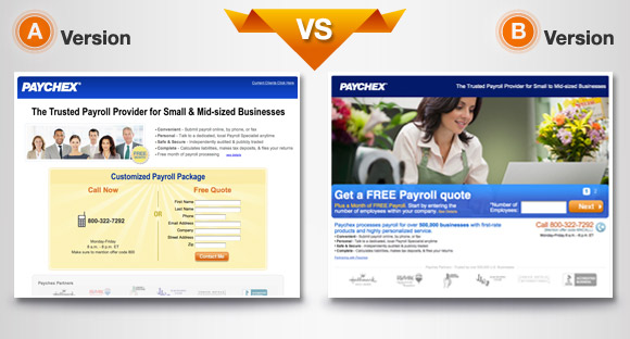
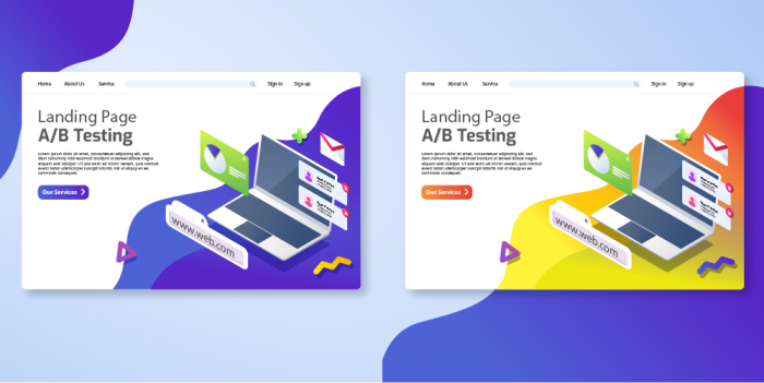
A\B testing is an experiment where two or more significantly different pages are displayed to users randomly.
Unlike other standard practices in digital advertising, this one takes more resources and bears the risk of failing to communicate the right message.
Deciding whether or not to launch A\B testing, you should be ready to take additional precautions to minimize these risks.
They say that good-selling commercial ads are all about inspiration and design. But, mostly, it is about a calibrated and mapped-out approach.
Title
There are only 8 basic A/B testing rules you should never break. If your A/B testing breaks even one of these rules, it is more likely to fail.
1. Blind A/B testing
If you choose two pages to run within a single test and they only slightly differ from each other, this can be considered a failure right from the beginning. Since the pages look alike, they will also display pretty similar results.
Instead, we recommended creating contrasting variants. For example, you can test two landing pages that differ in their approach for selling the product: a storytelling concept and quiz approach.
Both pages work in an interactive way, but storytelling appeal more to those who play the game of emotions and react to emotional narratives, and quizzes work for those who listen to their brain, not their heart.
The latter approach appeal more to those who love solving puzzles and prefer finding correct answers more than empathizing with someone’s success story.
Marketers often believe that the same story with different visuals is already considered a split test. That is just an illusion. Renderings matter, but if you are decorating the same text with various images, that’s still the same advertising approach, and thus, fit the same user group.
2. Add Novelty
To avoid financial risks, affiliate marketers are always searching for proven-to-work texts and images to overload within one link, believing this is the key to success.
In reality, however, users develop blindness to the visuals and titles they have already seen. This is why even the most successful landing pages stop selling over time.
Therefore, we highly recommend mixing old good articles with completely new ideas and approaches within a test.
So, even if the new knick-knack makes no use, the other one will save the campaign results.
3. Mind the GEO
One of the widest spread myths is that if a landing works brilliantly for one country, it will work everywhere with the same success.
Thousands of marketers have wasted time and money trying to copy the same story without changing a thing for multiple geos.
Think about why large companies organize dedicated focus groups to study cultural peculiarities for new regions.
They dive deep into traditions, trends, and bans to detect what is the best way to sell a new product to the locals. It turns out that even colors matter.
There are countries where white is not the symbol of purity and chastity but worn for funerals and mourning. So, a bride in her white gown is a reason to gasp, not to cry of joy for the lovely couple.
In other countries, a personal trainer exposing her abs at the gym can be taken as an affront and even a cute dog’s nose might be considered unacceptable.
Luckily, all this information is available online, and what one should do is dig into the life of the target audience, no matter who they are.
Avoid Language Mismatch
If you want the target audience to listen, you should speak their language.
If your message doesn’t match the target language, these people won’t be able to read the text and the testing will fail before starting.
However, there hardly is a country with only one single language for all ethnic groups within its borders.
What to do?
Mix it up. Experts advise you to choose English and one local language (one that is the most widespread). English, as an international language, can cover those people who are non-residents but are currently working in the country.
It also might target highly educated people who are not adept at another local language picked for the A/B test.
If you believe that choosing the official language is the only way to go, you are wrong. There are many countries where people prefer dialects to the official language. Choosing one of the most widespread dialects gives 100 additional points and a cut above the rest.
4. Do Not Clutter
When marketers see working concepts, they add them to their advertorials without any hesitation. Somehow, they believe that putting all working approaches in one place is the key to success, and A/B testing is the best background for this odd ‘collection’.
Research shows that is simply a mistake.
When landings seem overloaded with elements, they cause unfavorable emotions:
- irritation;
- deterrence;
- disappointment.
What is the alternative?
Choose 1 concept for each landing within a test and examine which of your concepts is the best for that specific vertical.
All additional elements should be added seamlessly and smoothly as if they were there from the very beginning. Additional elements shouldn’t arrest attention, jump at users or scream in their faces.
5. Mind the Hyperlinks
A hyperlink in the first paragraph is a frost. Somehow, it is believed that if the reader won’t face at least one anchored link at the very beginning of the article, conversions rate drop.
In reality, if the story is engaging and holds users’ attention from the first word until the end, the right place for hyperlinks is closer to the bottom.
There are success cases when developers integrate them into layouts without framing as the ones that lead to the offer.
6. Get a Heatmap Tool
How do you analyze the test without professional tools?
Clicks and conversion rate within a campaign is not enough to see the A/B test for what it is.
Heatmap tools are the best way to receive a drill-down report and current statistics. It is the most advanced way to understand users better and collect “qualitative data” on analytics and feedback from users.
In order to get the most discreet result on A/B testing, heatmaps are invented. They point out the spots on websites where users click more often and those that drag their attention.
Thus, providing with the ability to see which elements worked better for new conversions.
7. A/B Test the Ads
Last but not least, mind your ads.
Advertising units for A\B testing should illustrate various approaches so that they fit both landing pages. This is not an easy task but quite worthy to try.
As soon as the campaign launches monitor the ads carefully, change the CPC where needed and block those units that show zero results.
There is no such thing as ‘too much’ when it comes to variety in ad approaches. The more angles for one A\B test, the better.
Think about the various audiences that could be attracted by the offer and try to cover all segments.
Diversity is the key to success!

Alisa Svitlychna
Content Expert at MGID
Her basic rule is: no matter what you write - keep it short. As no matter how rewarding as tackling and immersive long reads can be, short but strong texts inger with us the longest and often become lifechanging.
Understand how 3G traffic and Wi-Fi traffic convert differently and get ready to boost affiliate marketing profits like a master!
CPM vs CPC? Who's gonna win this fight? Learn about the different price models and take your pick in this Mobidea Academy post!
Get to know all the advantages and disadvantages of push notifications.
