Master In-Page Ads on Push.House Ad Network
Last updated on January 11, 2022 by Mohammed AlMadhoun 4 min readHello, fellow affiliates!
Have you yet wondered what the hype around in-page push is all about?
On the one hand, we have the classic push ad format (which is a very popular ad format for a lot of affiliates), and, on the other, we have banner ads.
Each ad format has a large following of affiliates that like it for what it can offer.
But, as with any ad format, both classic push and in-page push ads have their shortcomings.
Now imagine for a moment if you could take the best parts of each one to make a new ad format.
Actually, you don’t have to imagine, as this format already exists, and it’s called In-Page Push.
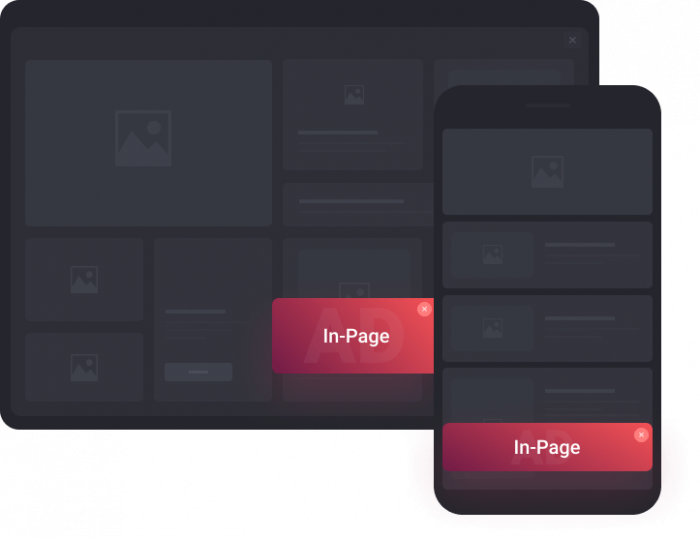
In-page Push is a hybrid style ad that looks and feels just like a regular push notification but operates as a banner inside the website.
Pretty neat, huh?
Let’s see how it looks!
What is In-Page Push, exactly?
In-Page Push is a banner ad on a webpage that does not have a fixed placement in a content block. Rather, it floats on the top or bottom corner of the screen, which makes it look just like a push notification ad.
It has everything a regular push ad would have, Title, Description, and Icon, so as far as the user is concerned, it’s basically the same thing. But, for an advertiser, there are distinct differences that make In-Page Push a game changer.
There are even more reasons to try In-Page Push. Push.House has created the perfect conditions for you to dominate this ad format, giving you the best CPC bids on the market! We’ll talk more about this in just a tick.
First, let’s find out what’s so great about this new ad format!
What Makes the In-Page Push Format Worth Your Time?
In-Page Push has a lot of neat features, that make it an exceptional ad format for all verticals:
- While it’s basically a banner, there’s no steep competition for In-Page Push ads, as you’ll find in regular banner advertisements. For newbies, display advertising can be a tough nut to crack, as it’s heavily saturated, and you would need a huge budget to fight your way to the top. In-Page Push operates differently; the competition is based on your CTR and CPC, just like in regular Push ads.
- In-Page Push feels like a regular push notification, so it catches the attention of the user, but it’s way less intrusive, so users interact with it more willingly than with other formats.
- One big flaw of classic Push notification ads is that when you send a push, you don’t know if the user is active. This means that by the time they see the ad, it may be displayed way down the notification bar. This all changes with the
- In-Page format, as the user only gets to see the ad when they are active on the site. This helps your CTR, gives you a wider reach, and boosts the overall performance of your campaign.
- In-Page Push solves the problem of “banner blindness”, which is a phenomenon where the users continuously ignores any information shown by the banner in a webpage, as it does not appear in the banner section of the webpage. This means much higher user engagement rates.
Why Run In-Page Push on Push.House?
Push.House has risen to fame by having a reputation for serving high-quality push traffic, and it aims to carry this legacy over to the new In-Page Push ad format.
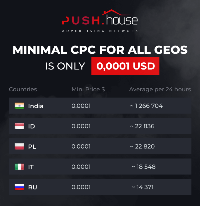
Push.House also offers the best CPC bids for In-Page Push on the market, starting from bids as low as $0.0001 for all GEOs.
This means you get the same quality, same volume, and a cheaper price!
Here’s an illustration showing the volume of In-Page Push traffic:
As you can see, there is more than enough traffic to go around, so now is the time to try out this new format for yourself, while the prices are at an all-time low!
But we wouldn’t want to just give you low prices, without giving you some insights about the traffic and campaign optimization.
Cheat Sheet to Make the Most of Your In-Page Campaigns on Push.House
There’s one element missing from in-page push campaigns, which you’ll find in the classic push notification format. This is the main image. You’ll find this makes it easier to run split tests, because you have one less element to test.
It also gives you a great opportunity to reduce your test budget.
How?
You can run multiple split tests on In-Page Push, and then, when you find a winning combination of (title+text+icon), you can also copy this to the classic push ad format.
This will save you both time and money during the test phase.
Then, when you copy your campaign to classic push, all you have left to do is to run a quick split of the main image.
Let me show you how to do this:
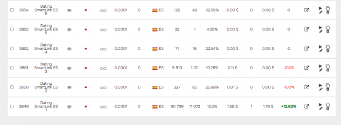
- We decided to run a simple SOI/DOI dating Smartlink. The targeted GEO was Spain, as we noticed some positive growth in dating conversions there lately.
- We made a quick test of 7 different creatives and ran all of them on the lowest bid, at just $0.0001.
After several hours, you could clearly see which creative performed the best. Some of them didn’t get any attention at all.
- We deleted all the campaigns except the one which converted, and soon enough, without any further optimization, the conversion rate increased.
- This winning campaign can now be copied to classic push, to cover another segment of the market in a different format and to scale your efforts.
- All you would have to do is to run a quick test to find a high converting main image, and you would have two campaigns which convert like crazy!
The goal here is to scale. You can easily run dozens of campaigns at the same time, securing a decent daily income. And, every time you find a winning creative, you can duplicate it to both classic push and iOS formats.
Combine this winning strategy with competitive prices from Push.House, and you’ll soon become an unstoppable force!
Want even more value? We’ll even throw in a bonus for good measure!
Simply add the code MOBIDEA50 to any new account, and get an extra 50% added to the value of your first deposit for free.

Mohammed AlMadhoun
PR Manager at Push.House
Mohammed is a multilingual copywriter, PR manager and translator at Push.House.
Learn how to use the SmartCPM tool like a king by reading this amazing guide created by the Mobidea Academy!
An offer's flow is crucial since it really does have an impact on conversions. Read all about mobile billing in this post!
Time for you to go ahead and dive into this analysis of Traffic Factory! Learn the best optimization tips for Traffic Factory right now!
