5 Most Common Mobile Pre-Landers That Convert
Last updated on May 21, 2018 by Raul Correa 10 min readIntroduction
Whether you’re a newbie in the affiliate marketing world or already a consummated veteran, you probably heard, or used, a lot of pre-landers.
Am I right?
If you check any forum thread, you’ll be able to understand people love talking about them all over the place.
Let’s start dealing with this topic as we Academy Wicked Writers usually do.
I’m gonna get real basic so you can follow from the get go.
Ready?
Mobile Pre-Landers Definition
First, let’s determine what the heck is a lander!
A lander is just the webpage that’ll appear when the user is directed to the offer.
That’s where the user actually confirms their conversion.
Now let’s understand what’s a pre-lander.
Considering the prefix, you can already figure out what a pre-lander is all about, right?
It’s a web page that comes before the actual landing page for the offer.
Simple. Easy.
Great!
The concept is clear now.
But why do people use it?
Isn’t it just another step before the conversion?
Well, yes.
But the thing is, people use pre-landers that help convince users, or predispose them to ultimately convert.
Meaning what?
That it’s gotta have content that engages the user.
What kind of mobile pre-lander is more engaging?
Well, this depends on many factors, such as the type of offer, the GEO and even smaller factors, like some colour or disposition in the pre-lander itself.
That’s why media buyers usually test many mobile pre-landers by split testing when launching campaigns.
In fact, they do this because they wanna see which ones perform better and then focus on those like real pros.
It’s very important to mention that a mobile pre-lander doesn’t do everything.
It’s still crucial to have a great banner that drives traffic to it (in the case of a display campaign) and a good offer that actually converts.
Now you know.
Now you can boast about the fact that you’ve mastered two cool definitions.
Ready?
Let’s roll and explore the content!
First of all, let’s check the most common characteristics of pretty much all types of pre-landers!
5 Must-Have Steps in Pre-Landers
Step 1: A clear call to action
They need a well-made, clear, and very explicit button that’ll guide users towards conversions.
Step 2: They need to have steps
This part is especially true for dating offers. As the user answers some questions and goes on to the next step, they feel increasingly more engaged. 3 to 5 steps.
That’s the usual recommendation.
Step 3: Have a catchy look
It needs to be aesthetically cool. It’s gotta be something a user will land on and that’s gonna immediately spark interest.
Why?
Because – in case it’s unappealing or bland – the user will simply close it and forget about it!
Step 4: It has to be beautifully designed
Shady, shoddy, low-grade kind of inferiorly designed pre-landers usually make the campaign worse.
If you can’t design to save your life you might as well stick with old school direct linking so you don’t embarrass yourself.
Step 5: It should load very quickly
There are lots of people who’ve already worked on the stats and it’s proven:
The longer it takes for your pre-lander to load, the lower your CR will be.
Don’t think about seconds, here.
Think about milliseconds!
For real!
Okay.
Now moving on to our list.
Sweepstakes – “Do you feel lucky? Well, do ya, punk?”
One of the types of offer that’s super popular is sweepstakes offers.
You know the ones, right?
They’re those that make the user fill out a form in order to get the chance to win a certain prize, most likely an iPhone or something similar.
This is a type in which pre-landers are very often used.
They can come in different forms, but one thing is certain: their purpose is to make the user more engaged and excited about the possibility of winning a free prize.
Below, you can see some examples of heavily used pre-landers for sweepstakes.
One of the most utilized is the spinning wheel.
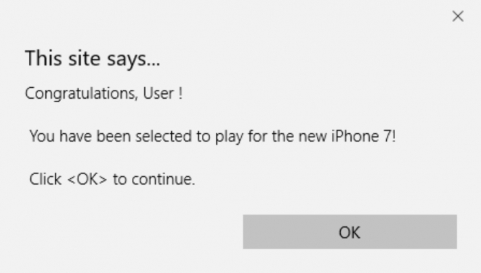
It basically starts with a pop message explaining you were selected for a prize.
In fact, you happen to be one of the few lucky guys who are part of an elite of humans that really do have a chance to win this super-amazing prize:
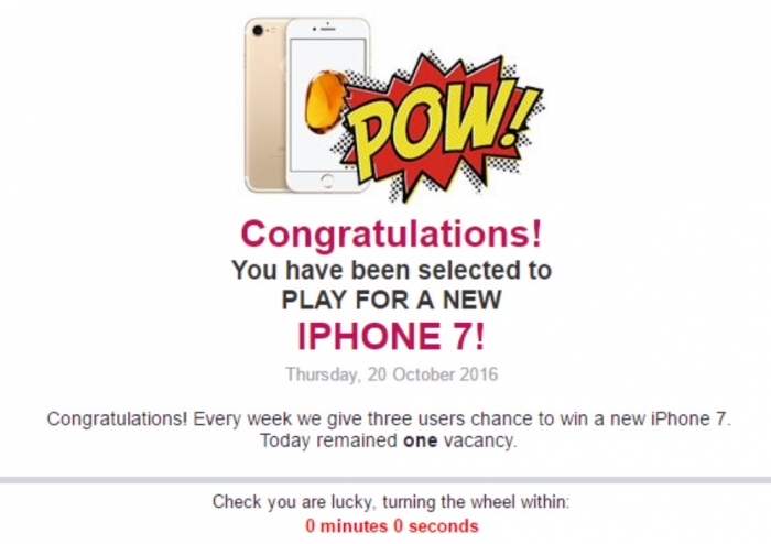
What people try to do sometimes is to be as detailed as possible about some key info, such as your device, your operating system or even the date.
The purpose is simple:
Making everything more credible.
Check it out:
Image: Dear Chrome user. You’re the lucky visitor for today – October 20th 2016.
Fill out this questionnaire. We’ll give you the chance to win an iPhone 6, a Nexus 6, or a GalaxyS6!
The header pretty much gives you the info and it usually contains a countdown.
This helps to make users rush like crazy to do their thing (even if the countdown restarts):
Then, there’s the spinning wheel.
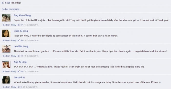
Lastly, there are usually some comments below.
They’re written by people that actually “won” the prize.
The idea is – again – to make this seem mega credible:
As aforementioned, these pre-landers come in different forms, but the spinning wheel has revealed itself as a recent champion!
Let’s move to the next one, shall we?
Performance Boosters
Another widely used type of offer is the so-called performance boosters.
Have you been able to spot those “cleaners” that promise to leave your computer faster and better?
Yup.
I’m sure you’ve seen them pop somewhere.
The process is similar to the one I’ve alluded to when exploring sweepstakes.
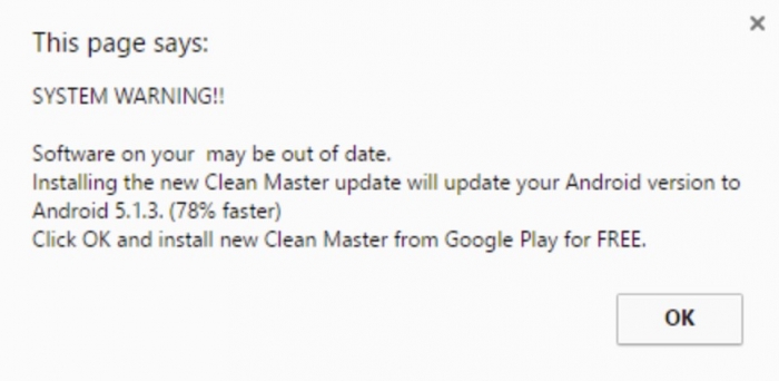
It starts with a warning: “Your system is out of date”, or “Your computer is running too slow.”
Stuff like this.
Here’s an example:
Then, a very clear call to action:
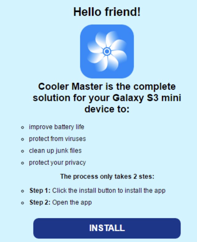
Some make an effort to seem more technical and clean.
Those usually identify your device, for instance, so as to make it more credible and also give you a few steps:
Moving on! Next type!
Games
Games! One of the main cores of the electronic industry!
Classic, right? Yes, they’ve always been around and I’m pretty sure they always will.
Here the pre-landers follow some special, different guidelines.
They’re usually very graphical, colourful and have to look even better.
Why?
Because they have to attract gamers (and sometimes kids).
They’ll basically consist of some super slick graphics on the back, with a short message about the game and a clear call to action.
Let’s take a look:
Oh, another important factor: the images need to be related to the game and its characters.
Bear that in mind and you’ll be good to go!
Antivirus
Antivirus. Another cornerstone of computer (and electronic device) history!
You didn’t think they’d be forgotten, did you?
Didn’t think so.
They’ve been widely promoted in affiliate marketing for quite some time now.
Now, their methods are similar to sweeps and especially performance boosters.
But, of course, with certain specificities.
These landers will normally contain an alert, followed by some nice features the software can provide you.
Followed by what?
You’ve guessed it.
A very clear call to action.
Check it out:
Image: SECURITY ALERT! Complete mobile protection!
Green button- Call to Action: Prevent attacks
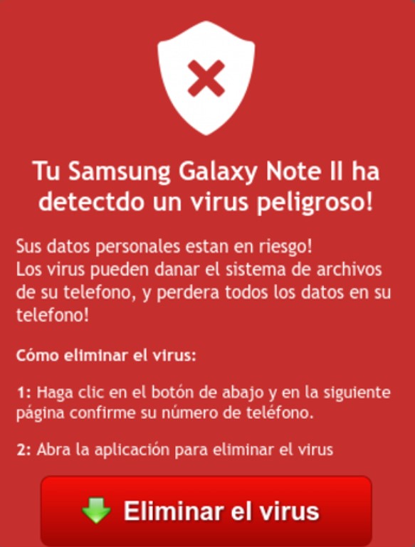
However, it’s very common to find more aggressive advertisement, where the intention is to make the user feel kind of afraid, so that they yearn for the chance of acquiring the antivirus or else something very bad could happen.
They’ll basically give you a warning with a countdown, after detecting your device.
To make sure you feel the pressure, got it?
Then they throw some technical info, some steps and, of course, the clear call to action. 52 viruses…pfff.
Looks like my device was in a brothel of Game of Thrones.
You can have some variations of this, but the great majority is following this script.
Let’s check another one with a different design, but pretty much doing the same stuff:
Image: Your Samsung Galaxy Note has detected a dangerous virus!
How to eliminate it? Click the “ELIMINATE VIRUS” red button.
Dating
Dating. We’ve all been there, right? This ancient practice has been all over the internet for quite some time.
These offers really need the help of our dear pre-landers.
There are two major categories in mainstream dating:
A more “grown up” type of offer, which is mainly aimed at people looking for a serious partner to probably share a life with.
Check this one:
They usually follow this pattern. A nice picture of a couple, some more detailed info about the advantages of the service, a clear reference to privacy and safety, and a very clear call to action.
Oh, they always mention that there are already thousands of members, and only you are missing all the action.
To finish it off, they’ll tell you it’s all FREE.
Then, we have a different type of dating offer, which is more focused on a younger audience that just wants to have fun or “have fun”.
It’s gonna look something like this:
These will have pictures of beautiful girls, probably partying hard and doing crazy things their mothers can never find out about!
There’s also some brief info and – very important – the mention that it’s all FREE.
In most cases, these will identify your location.
You’ll read something like “meet sweltering hot chicks that live near…” and then of course the sentence is completed with your exact location.
Sounds good, huh?
Yeah, there’s no such thing as 1392 girls within 5 km that want to spend the night with me (yes, I had a tough life in college).
To finish the deal, notice the really obvious, green and flashy call to action!
Yeah!
You already know you need to have one of those!
Conclusion
Enjoyed this lesson?
Now you can recognize the most widely used pre-landers around.
These prelanders can really be a very powerful tool to boost performance.
However, don’t kid yourself:
They’re not an easy tool, considering you really have to figure out what truly works or else the effect can be the opposite: ruining your performance.
My suggestion?
Read a whole lot and put some effort into designing and testing your mobile pre-landers.
Make use of all the tools available, especially split testing and A/B testing analysis.
Become a pro in this tool and you’ll see your results soar like a golden albatross!
That’s it for today, my friends.
Hope you liked this article and that it helped you grasp the importance and patterns of mobile pre-landers.
Best of luck out there!
Let’s keep those results growing faster than Yao Ming’s physique!

Raul Correa
Affiliates Business Developer
Raul Correa is simply one of the most dedicated and learned Media Buying Masters out there! He's always loved numbers and never forgets to put his awesome analytical skills to good use. He is now an Affiliates Business Developer and continues to rock on, creating some of the most famous Mobidea Academy articles of all time! When he isn't analyzing data or optimizing campaigns, Raul loves playing football and reading a great novel!
The affiliate marketing game is all about giving advertisers what they want! Learn how it's done and become an advertising expert!
AdvertisementChecked all the Mobidea’s tutorials but you’re still feeling lost on our platform? No worries! Daliya is our dope Community…
AdvertisementStill struggling to find the best offers because you know you wanna make money faster like a real master? Lost…
