What is a Call-to-Action and Why Do You Need One?
Last updated on May 8, 2018 by Francisco Gomes 9 min readIntroduction
What does Call-to-Action mean?
Want answers?
Need a Call-to-Action definition you can count on?
I’m here for you!
Read up and understand everything you need to know about the phenomenally exciting world of Calls-to-Action!
What is a Call-to-Action?
In the world of affiliate marketing, a Call-to-Action, generally abbreviated to CTA, is an instruction to a specific audience which is created in order to galvanize customers and make them effect an instant response.
Call-to-Actions tend to use imperative verbs so as to incite action.
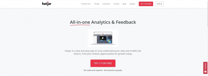
Source: HotJar
Call-to-Action copy is all about picking the right number of short words to galvanize users.
CTAs are usually a line of text or an image which prompts website visitors, customers and leads to start taking action.
Which action, you ask?
It can be anything, really.
It can be to sign up for Mobidea, attend an affiliate marketing trade show, download Affiliate Guides.
It can be clicking a landing page or a banner.
What do you want your audience to do?
What action must they perform to win the prize, start filling out the form, participate in the draw, become part of your TV show?
That action which you want your audience to undertake is what’s known as a Call-to-Action in the industry.
Know the action, define Call-to-Action, and reap the rewards of a great marketing strategy.
But wait!
There’s a bunch of different types of CTA, right?
Yes, indeed!
Types of Calls-to-Action
Now that I’ve given you the definition of Call-to-Action, it’s time to explore the diverse types you can play with.
Affiliate marketers and merchants must always bear some pretty distinct types of CTAs in mind.
Even so, most of these guys tend to stick with what they know.
Like most people, affiliates tend to have a favorite type of CTA which they use, recycle, rehash and reuse over and over again.
What does this cause?
It creates a dreadful stagnation!
No development!
No originality!
That’s right!
Affiliate marketing is a business which demands constant innovation.
You can’t be a one-trick pony in this industry.
Innovate or die.
That’s why I’m not only gonna refer to one measly type of Call-to-Action.
I’ll show you four types you can play with!
1. Simple CTA
Source: OfficeVibe
What do you want to do to someone who was kind enough to visit your website and is now trying to learn a bit more about the specific product you’re promoting?
You make life easier for them.
You make it simple for them to find what they want and give them a CTA that’s clean and effective.
It’s all about your product, right?
That’s the reason why customers wanna reach your website in the first place.
Product.
What you have to offer.
That’s why you go simple and smart.
This is the most popular CTA around.
It’s just a text with a helpful button below, which must obviously stand out for people to know where to click.
Easy stuff!
Loved this example of a Call-to-Action?
Keep reading!
2. Mighty “Read More” Button
How are you supposed to galvanize users to read further?
Potential customers are reading your affiliate marketing blog.
They’re interested, engaged, and alert.
But you want to make sure there’s a moment in which the text stops showing and they must make a decision:
“Should I fall for this bait and click?”
“Should I stop reading this impressively mesmerizing content and get away?”
That’s what users are thinking.
What about you?
That’s right!
You’re thinking about how you’re gonna make that READ MORE button pop real nice!
That’s why you’re gonna entice and attract your viewers.
You want them to be so into your content that they fall in love and click the READ MORE with gusto.
Why should you use the READ MORE technique?
Why is it one of the best (and proven) examples of Call-to-Action that all marketers have become acquainted with throughout their career?
Two reasons:
First, the READ MORE button allows for more of your incredibly complete content to actually be featured on the feed of your homepage.
Second, READ MORE buttons will allow you to understand what your most important content is.
That sweet evergreen content, bro!
This really is one of the best Call-to-Action buttons!
This means each of your individual posts will get credited with its own traffic, instead of just your homepage.
Get them to click, get them to read, get those conversions, and make it rain!
Use those amazing Call-to-Action boxes to drive conversions and become the Call-to-Action button king!
3. Lead Generation
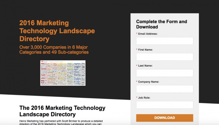
Source: Heinz Marketing
In the Mobidea Academy, you know we love writing about lead generation.
Why?
Because lead gen Calls-to-Action are some of the best Calls-to-Action around!
They’re tremendously important since they can really help you get those saucy leads you need for your site.
Using these highly-popular lead gen CTAs, you’re making sure that customers who visit you will eventually become leads.
Where the heck should you place these lead gen gems?
Study your website’s heat map, understand where new visitors are looking at, and make sure you place the lead gen CTA right there.
You really want the highest percentage of new visitors possible clicking on this type of Call-to-Action.
Where do most bloggers insert this type of blog Call-to-Action?
- Sidebar
- Floating banner (corner)
- End of their articles
Where do most Media Buyers insert this type of CTA?
- At the end of the article
- In the middle of the article
In general, affiliates tend to keep it simple.
They tend to pick those which are regarded as the best Call-to-Action phrases.
Want a Call-to-Action example?
They use CTAs like “continue”, “download”, “watch”, “go for it”, etc.
When it comes to sweepstakes, Media Buyers change their approach.
In that specific case, they use push notifications such as “continue”, resembling the style of a WARNING.
What should you do to craft a high-converting lead generation Call-to-Action with the best Call-to-Action words?
Make it pop!
It’s gotta have some bright colors and it must really stand out.
These CTAs must also be able to showcase what’s in it for the people who click.
What’s the prize, the value.
What will they gain from clicking?
The goal?
To make sure users know what’s waiting for them after they click the CTA!
4. Form Submission
Let’s pretend your users have landed.
The eagle has reached the nest.
They’re in.
What should these users do now?
Two more exciting things:
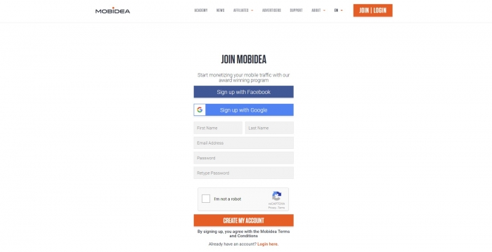
First, they should fill out an old-school form.
Second, it’s time they click a button.
Got it?
It’s almost done.
Your users are almost becoming a great lead.
This two-part process that I described is crucial.
Imagine your users are ready to pop and lock and then look at a disappointing submit button.
It’s the end for you!
You’re amazing and have managed to get these people to give you that first click.
Now, you need to take it home.
You need something that’s not only mighty actionable but also super specific, and which also takes the offer you’ve got into account.
You must adjust this incredible submit button to the particular offer.
What to do?
Make sure that not only your initial CTA is gold.
You’ve gotta go all in when it comes to creating a mega appealing lead capture form and submit button!
How to Create an Awesome Call-to-Action
It’s Call-to-Action design time!
Let’s think outside the box.
Innovate, innovate, innovate!
Most affiliates run the same scheme and use the same CTAs.
You’ve gotta change the game.
The aim?
Getting more users to go through your CTA so as to make sure you get more money.
How to do it?
You can create a custom image for your website, for instance.
Let’s say you’ve got a product.
Take the image of that product, add a wee bit of text.
What should the text be about?
A sleek, simple CTA that convinces people to click.
They’re gonna get a better price, or a 30-day trial, whatever.
Make it simple and irresistible.
These images are a proven gold mine in the game, since they not only get much higher Click-Through Rates but also represent a more optimal Call-to-Action type.
Remember when I told you about Call-to-Action buttons?
They’re an effective arrow in your affiliate marketing quiver.
Buttons rule!
The best part?
Most WordPress themes will allow you to use buttons.
They’ve got a sort of Call-to-Action button maker.
They come in the form of short codes and are super easy to use.
Don’t have a WordPress theme that has shortcode buttons available?
Learn More: 25+ Best Affiliate Marketing WordPress Themes You Should Know
Want more cool WordPress plugins to add?
Need a list of the best WordPress Call-to-Action button plugin providers?
- ThriveLeads
- Sumo
- OptinMonster
- Hello Bar
- WP Notification Bar Pro
- WordPress Calls-to-Action
- Shortcodes Ultimate
Use these awesome tools to wow customers with your perfect Call-to-Action button text and craft a WordPress Call-to-Action that makes you proud!
Call-to-Action: Best Practices
Time for me to give you some great best practices for Calls-to-Action!
These will allow you to expand your knowledge, use awesome techniques and also make sure your Call-to-Action beats the competition senseless!
Test Your Options
What to do when you’re trying to understand what types of Calls-to-Action got more conversions or clicks?
You test a few of them, of course.
Using A/B testing, you’ll get the informative data you need to make accurate decisions.
The data will allow you to effectively understand which CTA options are proven gold and which have gotta be buried in the sand.
How to write a Call-to-Action that drives those conversions to the top?
Test away!
Be Straightforward
People aren’t silly rabbits.
They know that clickbait is one of the common evils of this social media crazed society.
They know what’s balderdash.
They’re used to clickbait, hogwash and can immediately identify those hackneyed social media Call-to-Action phrases that are all part of the regularly used marketing playbook.
They know how to find the real deal.
That’s why you must avoid click-baity CTAs.
Your CTA must be as clear as possible.
Straightforward, honest.
People like knowing what the pool is before they dive into it!
Be honest with people.
Make sure your website Call-to-Action isn’t a bunch of lying clickbait.
I can guarantee this straightforward attitude is gonna get you more (and more profitable) clicks.
Make it Short
CTAs have gotta be short.
I think that’s Call-to-Action 101.
It’s about getting users to click knowing what the offer is all about.
Be concise.
Your users will definitely prefer you keep it short.
Short imperative sentences get you higher!
Get the Color Right
Call-to-Action color?
Super important!
Color is also another crucial aspect that comes into play when you’re creating a Call-to-Action.
Pick a color that actually stands out.
The idea?
Making sure your CTA is visible and doesn’t just blend in like a chameleon.
That’s how you lose profit, guaranteed!
Go Verbal
Action verbs are fundamental here.
You wanna be certain that your Call-to-Action showcases a mega powerful action verb.
Verbs, bro!
They’ll make sure your message stands out and gets noticed.
Get some verbs in those Call-to-Action taglines, okay?
Conclusion
Enjoyed this Call-to-Action lesson that allowed you to understand how to efficiently craft the very best Call-to-Action?
Now you know what Call-to-Action means and you know you can use CTAs to increase your conversions.
You’ve learned about what is a good Call-to-Action, what are the coolest Call-to-Action ideas, the most popular types of Call-to-Action, and you’ve also become acquainted with the best practices for Calls-to-Action.
Remember this, though:
It doesn’t matter which system you’ve created to make those interested users click.
What’s important, then?
That you at least have come up with a sort of systematic process that you can use.
Something of a Call-to-Action template that you can drive to launch, test, and improve on a daily basis.
That’s Call-to-Action marketing done right!
Try different CTA techniques, A/B test, explore the different Call-to-Action examples, and get more money like it ain’t funny!
Now that you know what is a Call-to-Action on a website, it’s time for you to earn big!
Cheers!
See also:

Francisco Gomes
Content Professional
Francisco Gomes is a Portuguese copywriter and a stingy Mobidea Crew member who may not spend a lot of money but writes amazing words which could be auctioned for millions of dollars on eBay. That must be why his articles are super well-researched and loved by affiliates of all walks of life. If you want to read about some of the most important concepts in Affiliate Marketing, then the content created by Mobidea's Content Manager is gonna help you out in no time!
Understand how you can use native advertising to leverage your affiliate marketing profits in 2018 and become the internet marketing master!
Wanna understand how to really create the most epic lead generation marketing campaign? Don't waste your time and check this article!
Ready to finally understand what is an ad exchange and how you can use these platforms to improve your affiliate marketing profits?
